Wine + Data in Chinese: The View from Ningxia Region
It was a little trippy, I gotta tell ya.
This past week I traveled to China, first to visit the wine region of Ningxia (which is a two-hour flight to the west of Beijing) and then to Shanghai for Prowine China.
In a word? Fascinating, in many ways.
I tried to take some pictures and record some thoughts and capture, visually and in writing, a little of what things were like. It was tough, because the experience was both disorienting and overwhelming on the one hand, and trippy and fascinating on the other, all at the same time.
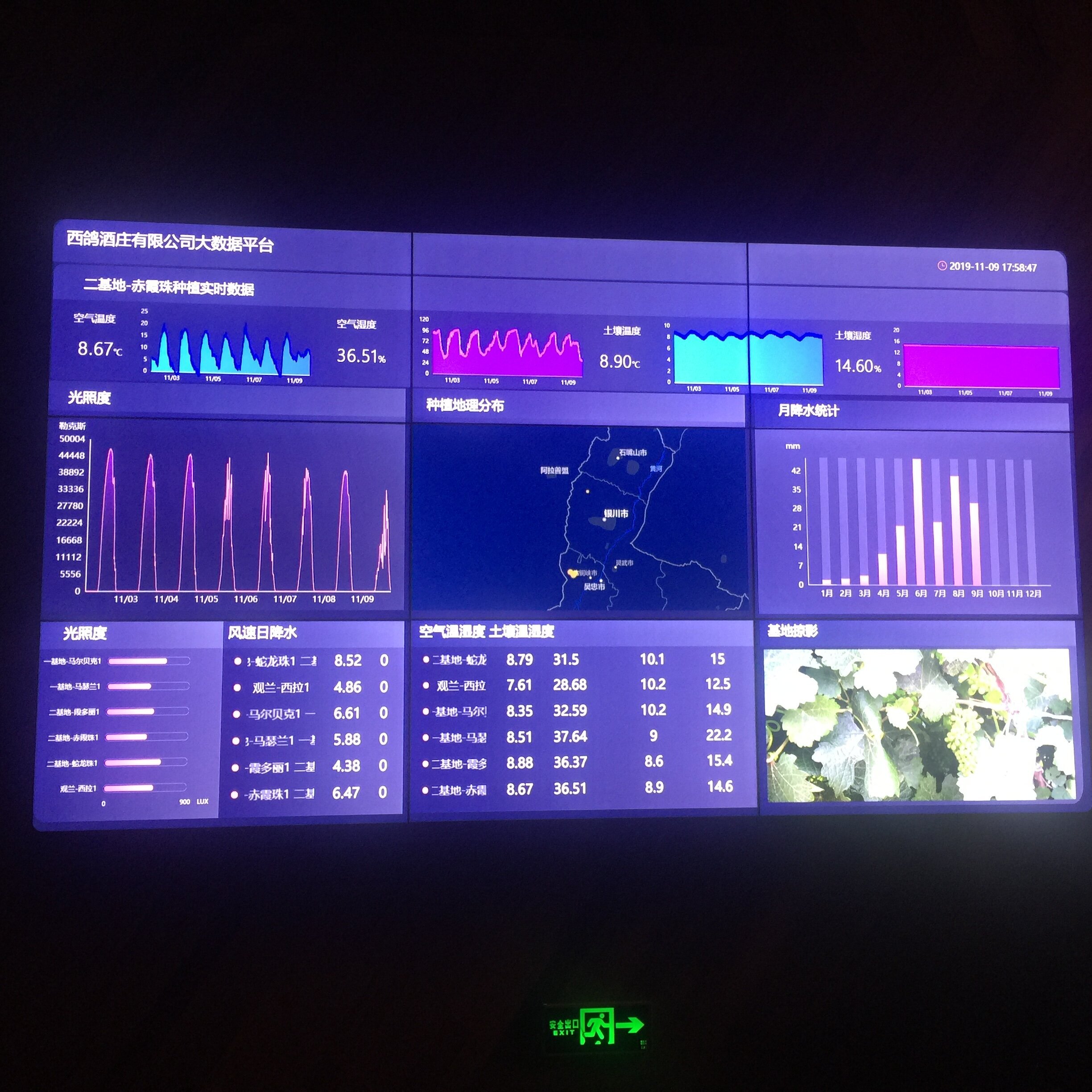
That brings me to this image, above, taken at a winery called Xige Estate in Ningxia.
First I need to tell you about the scale of this. The room was dark so a person or even a chair doesn’t render in the picture to give you a sense of perspective. But it was big. As in, wall-size big. As in, cool “command central” big.
Next let me tell you about the information that’s being displayed. The field in the bottom right of the screen updated and rotated regularly, showing a vineyard overview in one turn, a vine close-up the next, and so on throughout the winery’s landscape. The other fields on the screen display things like precipitation, temperature and humidity over days and weeks.
They’re all things that any winemaker or grower would want to know, and it makes for an impressive display for any visitor to notice.
From a data perspective, here are some things that I noticed, and that kicked my imagination into gear:
The number and type of sensors needed throughout the vineyards, in order to track all of this information.
The notion that the viticultural data is being monitored and measured so comprehensively and with such precision.
The extent to which these measurements are automated and archived, which leads me to imagine the potential for analysis and studies over time.
And this was just the viticultural side of data at this winery. Winemaking and sales are each their own world of data. The irony is the differences of scale between those worlds: hyper-granularity at one end (the mobile sales end) of the scale, and massive production at the other end (the growing and winemaking end).
Whether or not any of this fits into your ideas of what wine “should” be, it’s worth pausing to consider the reality of it for an increasingly thirsty population.
There are things we can learn from that, not least of which is the visualization component. Your data could look something like this too, especially if your desktop or laptop is “command central” for your business.
What do you need to be continually monitoring? What do you need to see, that you think maybe you aren’t seeing right now as well as you could?
We can help.
Thank you for coming along on the ride with me this week.
Cathy

